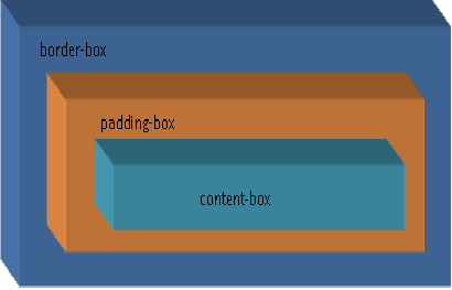
I have already written about CSS border properties in
Margin, Border and Pdding Properties. This article contains the description "border-style", "border-color","border-width".
There are few more properties added with introduction of CSS 3.
Following are the properties introduced with CSS 3 :
1. border-radius
This property is useful to give rounded corners to any element. This property allows developers to give rounded corner elements in their design. This elements having round corner background images and multiple div tags.
"border-radius" is the short hand version of the border-*-*-radius. Following is the syntax using which we can implement the border radius property:
Syntax:
border-radius: <length | percentage %>
border-top-left-radius: <length | percentage %>
border-top-right-radius: <length | percentage %>
border-bottom-left-radius: <length | percentage %>
border-bottom-left-radius: <length | percentage %>
Example :
In the following example border-radius: 20px. We can change the radius by entering it in the text box below.
In the following example border is set for the top-left, top-right, bottom-left and bottom-right of each element.
border-top-left-radius: 50px;
border-top-right-radius: 50px;
border-bottom-left-radius: 50px;
border-bottom-right-radius: 50px;
2. box-shadow
The
box-shadow property allows to give shadow effect any element. Following is the syntax for box-shadow:
box-shadow: H-shadow V-shadow blur spread color inset
H-shadow: Horizontal shadow this is required value, we can have negative values as well.
V-shadow: Vertical shadow this is required value, we can have negative values as well.
blur: set the blur effect of shadow.
spread: This decides the size of the shadow.
color: this decides the color of the shadow.
inset: This sets the shadow inner shadow effect
Example:
box-shadow: 10px 10px 10px 2px black;
box-shadow: 10px 10px 10px 2px black inset;
box-shadow: -10px -10px 10px 2px black;
