Showing posts with label CSS3. Show all posts

Tuesday, September 17, 2013

Adding Arrow to Menu

While working on the menu's. I wanted to add a new features of Arrow to the menus. To add a Arrow where a child menu is present with the "Parent Menu".
Following is the sample of what we are going to create:

The "Product" and "Services" menus are the ones with sub/child menu. To indicate that these menus are having the child menus arrows are displayed on right side of the menu.


Along with the parent menu "Product" first child menu "Product 1" is also having the arrow to indicate the arrow for multilevel sub-menu.

Now following is the HTML code for the menu:


Each level of menu is assigned a class for parent menu "parent_menu"  and for child menu "child_menu".
Another class is added for "Arrow" to the parent menus "has_child".

Following is the CSS code for creating and displaying the "Arrow" for the parent menu:
:after and :before pseudo classes are used to create the arrow.
For creating the arrow use the content property and set the position to "absolute".  Also note that to use only use the one property out of top, bottom, right, left and also use the margin property to set the proper position of the arrow.


  • .menucontainer li.has_child:after
  • {
  •     content: '';
  •     position: absolute;
  •     border: 7px solid transparent;
  • /* This will set the direction of the arrow.*/
  •     border-top: 7px solid white;
  •     top: 34px;
  •     margin-left: 5px;  
  • }
Following is the hover effect for the arrow with menu.
  • .menucontainer li.has_child:hover:after
  • {
  •     content: '';
  •     position: absolute;
  •     border: 7px solid transparent;
  •     border-top: 7px solid black;
  •     top: 34px;
  •     margin-left: 5px;  
  • }

You can find the complete code on the jsFiddle: "Arrow to Menu"

Saturday, September 7, 2013

CSS Drop Line Menu

There are various types of the menus available on the web. I wanted to learn and create a drop line menu.
A menu as shown in the image below:


When creating a menu always start with a simple HTML menu structure containing ul and li tags.
Following is the structure created for the menu. (The entire code is written on the jsfiddle, so you can change it as you like).

HTML


While creating a drop down menu we can set the
position:relative
but for Drop Line Menu set the
position: absolute

Following is the CSS used for creating the menu. I have included using the jsfiddle and its commented. If you have any doubts please leave a comment.


CSS

FINAL RESULT

Sunday, September 1, 2013

CSS3 Circular Menu

Creating menu using CSS3 is quite easy and fun. To create a circle for each menu item you need to work with border-radius.  While creating the circular menu I used the "CSS3 Simple Horizontal menu". While doing it removed unnecessary CSS code.
  To create a circle using border-radius property make sure that values for height, width and border-radius are same.
For example if the height and width of the menu is 90px, then the border-radius should be kept to 90px as well.
I have created the code using the jsfiddle. If you want to change it according to your need "Click here".

Note: The border-radius property is supported in : IE9+, FF 4+ , Opera 10.5 +, Safari 5+ and chrome.

For older version of FF and Safari -moz and -webkit prefix are used.

HTML


CSS


After completing the code menu would look like as follow:

Result


Friday, August 30, 2013

Simple CSS menu 2

We can create different types of menus using CSS. The menu created in this article is simple and created using only CSS3 and HTML. This one is coded in jsfiddle, if any one wants to check the code they are sure welcome.

HTML

CSS

Final Result


Wednesday, August 28, 2013

Jquery CSS Arrow generator

I am learning jQuery and CSS3 is quite a fun. I wanted to create arrows for my tooltip using the jquery and CSS.But got interesting in creating arrows so I started creating "Arrow Generator", its still work in progress but sample code is ready.
I have coded it using the jsfiddle.

Saturday, August 17, 2013

CSS 3 Text Properties


    There is already a article on this blog for properties that were define prior to CSS 3, Text Properties.


   hanging-punctuation

In typography hanging punctuation is used for keeping the flow of the text for readers. It outdent’s the punctuation marks such as “quotes”, bullets. You can read more about “Hanging-punctuation” in typography.
Following image shows the example of the hanging punctuation. 


In the above image it is left side shows the outdented bullets. While on the right side of the image shows the bullets as part of text.
The hanging punctuation effect can be achieved by using CSS3’s “Hanging-punctuation”

Syntax:

 hanging-punctuation: <value>

Following are the values that are used for hanging-punctuation:

Value
Description
none
No punctuation marks are allowed outside of the box.
first
Allows the hanging of punctuation marks at start of first line of text in the box.
last
Allows the hanging of punctuation marks at end of last line of text in the box.
allow-end
The punctuation mark is allowed to hang outside at the end of all lines in box, but it’s optional. It may reside in the box if the justification is defined
Force-end
The punctuation mark is forced outside the box at end of all the lines.


The punctuation marks that are allowed to hang are as follow:
Uni-Code
Character(Punctuation mark)
Name
U+002C
,
COMMA
U+002E
.
FULL STOP
U+060C
،
ARABIC COMMA
U+06D4
۔
ARABIC FULL STOP
U+3001
IDEOGRAPHIC COMMA
U+3002
IDEOGRAPHIC FULL STOP
U+FF0C
FULLWIDTH COMMA
U+FF0E
FULLWIDTH FULL STOP
U+FE50
SMALL COMMA
U+FE51
SMALL IDEOGRAPHIC COMMA
U+FE52
SMALL FULL STOP
U+FF61
HALFWIDTH IDEOGRAPHIC FULL STOP
U+FF64
HALFWIDTH IDEOGRAPHIC COMMA

Note: As this is an optional property most of the browsers do not support it.

   text-justify 

The text justification property aligns text, images equally in the given margin from both ends of the line. "text-justify" is used when text-align is set to justify. This property defines the method of justifying the text.

following are table contains the values for text-justify:

Value
Description
none
No justification is specified
auto
 The browser decides the justification for text
inter-word
 Decides the justification between the words in text.
inter-ideograph
 Decides the justification for the ideographical text. It is used to specify the justification between ideographical text and symbols.
inter-cluster
It decides the justification for the text which does not have any inter-spacing between the words. It specifically designed for Asian languages.
newsletter
 Decides the justification between the words and lines as and when necessary.
disturbute
It works as "newsletter" property, It is very useful for Asian languages.
kashida
 Decides the justification by elongation the cursive text.


Syntax:

 text-align: justify;
 text-justify: none| auto| inter-word| inter-ideograph| inter-cluster| newsletter| disturbute| kashida


   text-outline 

       This property is used to define the outline for the text. Following is the simple example of effect that should get generated by text-outline property

Syntax:

    text-outline: <length> <length> <color>;


Value
Description
(First)<length>
 This defines the outlines thickness
(second)<length>
 This defines the blur radius for the blur effect of the outline
color
defines the color of the outline

Note: As this is an optional property most of the browsers do not support it.


   text-wrap

          This property defines the methods for wrapping the text in the box.

Syntax:

    text-wrap: none | normal | suppressed | unrestricted ;


Value
Description
none
Text is not wrapped and if the text does not fix the box it overflows.
normal
 The lines are allowed to break at given breakpoints.
suppressed
 Line breaking is suppressed within  the element.The line breaks only if there is no valid break point in the text. If the line break is there it is done as with normal.
unrestricted
 The line may break between the two words/characters.

   
    word-break

This property specifies that the line can be broken between any two characters. Unlike the line breaks appear at white space or any punctuation mark.

Syntax:

    word-break:  normal | keep-all | loose | break-strict | break-all ;


Value
Description
normal
 Breaks the lines according their own rules
keep-all
 The lines are allowed to break at given breakpoints, same as normal. This is normal for all non-CJK characters. Breaks are not allowed in CJK text
loose
 Normal for non-CJK characters. But for CJK characters line breaks are less restrective.
break-all
The break all works normal for CJK characters. But for all the non-CJK character content the line may break arbitrarily.
break-strict
The break strict works normal for CJK characters. But if the CJK characters contain the non-CJK characters. It is specifically useful for Korean language.

This property is supported by all the major browser except for Opera.

Example:
Following example shows the of break-all value.

<div style="border: 1px dotted black; height: auto; width: 52px; word-break: break-all;">
      This is simple text showing example of word-break property is used
</div>


This is simple text showing example of word-break property is used.

Tuesday, April 16, 2013

Color Scheme Generator


Monday, March 25, 2013

CSS 3 Background Properties

I have already discussed about the background properties in Color and Background Properties.

background-size: 

 The background-size allows to decide the size of the image. Before CSS 3 size of the image was the size of the background image. With CSS 3 we can decide the height and width for the background image, following is the syntax for background-size:

background-size: <width> <height>;

Example :


This is sample for "background-size"


Its a very good feature


The one good feature added with CSS3 is that you can add multiple background images.


Its a very good feature. The grass and tree are from two different images. But still both can be seen as background of single element.


background-origin:

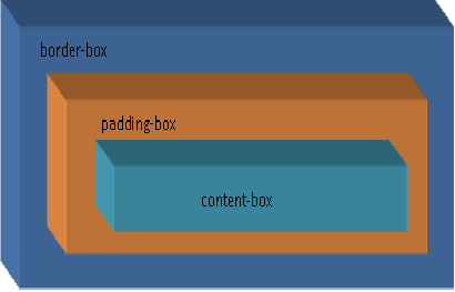
     The background-origin property decides origin of the background image. It can start from border-box ie from border or padding-box from padding or can be placed only in the content box.


Example :


background-origin: border-box


background-origin: content-box

Monday, March 18, 2013

CSS 3 Border and Shadow Properties

 I have already written about CSS border properties in Margin, Border and Pdding Properties. This article contains the description "border-style", "border-color","border-width".
There are few more properties added with introduction of CSS 3.

Following are the properties introduced with CSS 3 :

1. border-radius

     This property is useful to give rounded corners to any element. This property allows developers to give rounded corner elements in their design. This elements having round corner background images and multiple div tags.
    "border-radius" is the short hand version of the border-*-*-radius. Following is the syntax using which we can implement the border radius property:

Syntax:

border-radius: <length | percentage %>

border-top-left-radius: <length | percentage %>

border-top-right-radius: <length | percentage %>

border-bottom-left-radius: <length | percentage %>

border-bottom-left-radius: <length | percentage %>


Example :


In the following example border-radius: 20px. We can change the radius by entering it in the text box below.


Enter radius :


In the following example border is set for the top-left, top-right, bottom-left and bottom-right of each element.

border-top-left-radius: 50px;


border-top-right-radius: 50px;


border-bottom-left-radius: 50px;


border-bottom-right-radius: 50px;


2. box-shadow

         The box-shadow property allows to give shadow effect any element. Following is the syntax for box-shadow:

 box-shadow:  H-shadow V-shadow blur spread color inset

H-shadow:  Horizontal shadow this is required value, we can have negative values as well.

V-shadow:  Vertical shadow this is required value, we can have negative values as well.

blur:  set the blur effect of shadow.

spread:  This decides the size of the shadow.

color:  this decides the color of the shadow.

inset: This sets the shadow inner shadow effect

Example:

box-shadow: 10px 10px 10px 2px black;


box-shadow: 10px 10px 10px 2px black inset;


box-shadow: -10px -10px 10px 2px black;


Wednesday, March 6, 2013

CSS 3 Selectors

With the introduction of CSS 3 many new selectors have been added to the CSS. We have already discussed selectors in CSS in following post:
CSS Selectors, CSS Link Styling, Pseudo Elements and Pseudo Classes.

CSS 3 Selectors


1.  Element1 ~  Element2


      In this type the style is applied to all the element's that are present after the element1. This is type of element selector.
  
Example:

div ~ table{
border: 0px;
background-color: red;
}


The above example will apply style to all the table elements present after div element in the document.


2.  Element [Attribute^="value"]


  This is attribute selector. This element selects the elements with attribute value starting with specific sub-string.

Example:

div [id^="test"]{
background-color: blue;
}


Above style will be applied to all the div elements which has id attribute that begins with "test".
 

3.  Element [Attribute$="value"]


  This is attribute selector. This element selects the elements with attribute value ending with specific sub-string.

Example:

a [href$=".html"]{
background-color: blue;
}


Above style will be applied to all the Anchor <a> elements which has href attribute that ending with ".html".

4.  Element [Attribute*="value"]


  This is attribute selector. This element selects the elements with attribute value having specific sub-string.

Example:

div [class*="test"]{
background-color: blue;
}

Output :

Get your potbellied pig to mate

Above style will be applied to all the div elements which has class attribute with value that contains sub-string "test".


5.  :root


 This is a "Structural Pseudo Element". The ":root" pseudo element applies style to the root element of the document. In html documents root element is always <html>.

Example:

:root{
background-color: blue;
}


6.  :nth-child(n)


 This is a "Structural Pseudo Element". The ":nth-child(n)" pseudo element applies style to the "nth" element of its parent. Where as n mentioned in the syntax can be a "number",  or a "formula" or "Keywords(even, odd)". 

   :nth-child(n) : This will select the nth element of its parent.


   :nth-child(an+b)  :  The formula acts as a counter and style is applied to every element after specific                intervals. n starts with 0. The 'a' and 'b' are two positive integers, values of both must be greater than equal to 0. We can use Addition and Subtraction operation in the formula.


   :nth-child(even) : This will apply style to all the even elements to apply style.


   :nth-child(odd) : This will apply style to all the odd elements to apply style.


 Example:


    div:nth-child(1) : This will select the first element of its parent.


   div:nth-child(2n+1)  :  The "2n+1" formula will select the elements starting from 1st  element(n=0), (n=1) 3rd element, (n=2) 5th element and so on.


   p:nth-child(even) : This will apply style to all the even para tags.


   p:nth-child(odd) : This will apply style to all the odd para tags.


7.  :nth-last-child(n)


            It is similar to the ":nth-child" except it will select child elements from end of parent.  It also uses numbers, formula and keywords.


   :nth-last-child(n) : This will select the nth element of its parent.


   :nth-last-child(an+b)  :  The formula acts as a counter and style is applied to every element after specific                intervals. n starts with 0. The 'a' and 'b' are two positive integers, values of both must be greater than equal to 0. We can use Addition and Subtraction operation in the formula.


   :nth-last-child(even) : This will apply style to all the even elements to apply style.


   :nth-last-child(odd) : This will apply style to all the odd elements to apply style.


8.  :nth-of-type(n)


        This will apply style to nth element of its parent having n-1 element before it. It can have values as numbers, formula or keyword.

For syntax you can look at the  :nth-child(n).

The major difference between nth-child and nth-of-type is that, the nth-child(3) will select the third child of its parent. Where as the nth-of-type(3) will select the third element a particular type of its parent.


9.  :nth-last-of-type(n)


        This will apply style to nth element of its parent having n-1 element after it. It can have values as numbers, formula or keyword.

For syntax you can look at the  :nth-last-child(n).


10.  :first-of-type


              This is a "Structural Pseudo Element".  This will select first child element same as type of its parent.
It will similar to :nth-of-type(n), except it will select only first element.


Example:

Following code will select the first div element.

div:first-of-type{
border: 0px;
background-color: red;
}


11.  :last-of-type


              This is a "Structural Pseudo Element".  This will select last child element same as type as its parent.
It will similar to :nth-last-of-type(n), except it will select only last element.


12.  :only-of-type


           This is a "Structural Pseudo Element".   This will select the only element of its type, of its parent.


Example:

Following code will select the only span element.

span:only-of-type{
border: 0px;
background-color: red;
}


13.  :only-child


           This is a "Structural Pseudo Element".   This will select the only element of its parent.


Example:

Following code will select the only span element.

span:only-child{
border: 0px;
background-color: red;
}


14.  :only-child


              This is a "Structural Pseudo Element".  This will select last child element of its parent.


Example:

Following code will select the last div element.

div:last-of-type{
border: 0px;
background-color: red;
}


15.  :empty


                        This will apply style to all the empty elements. These elements should be empty it should not contain text nodes.